
How to Customize Cart CSS with Checkout+
Overview
CSS customization in Checkout+ gives you full control over the look and feel of the Checkout+ section of your cart, so it fits seamlessly with your brand. This article covers how to use CSS customizations available with Checkout+ to adjust cart styling, from basic style changes to more advanced custom cart design.
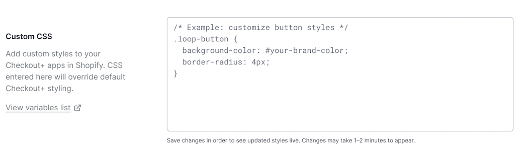
Maximum Length is 10,000 characters.
To customize your CSS, navigate in Loop admin to Returns Management > Policy settings > Checkout+ > Custom CSS
Allowed CSS Properties
Typography | font-weight |
Typography | font-style |
Typography | line-height |
Typography | text-align |
Typography | text-decoration |
Typography | text-transform |
Typography | letter-spacing |
Box Model | width |
Box Model | height |
Box Model | min-width |
Box Model | min-height |
Box Model | max-width |
Box Model | max-height |
Box Model | padding |
Box Model | padding-top |
Box Model | padding-right |
Box Model | padding-bottom |
Box Model | padding-left |
Box Model | margin |
Box Model | margin-top |
Box Model | margin-right |
Box Model | margin-bottom |
Box Model | margin-left |
Borders | border |
Borders | border-top |
Borders | border-right |
Borders | border-bottom |
Borders | border-left |
Borders | border-width |
Borders | border-style |
Borders | border-radius |
Display & Visibility | display |
Display & Visibility | visibility |
Display & Visibility | opacity |
Flexbox | justify-content |
Flexbox | align-items |
Flexbox | flex-direction |
Flexbox | gap |
Transitions & Transforms | transition |
Transitions & Transforms | transition-duration |
Transitions & Transforms | transition-property |
Transitions & Transforms | transform |
Transitions & Transforms | scale |
Transitions & Transforms | rotate |
Transitions & Transforms | translate |
Miscellaneous | cursor |
Miscellaneous | box-shadow |
Miscellaneous | text-shadow |
Miscellaneous | overflow |
Miscellaneous | white-space |
Structural Rules
Braces { } must be balanced (media queries and nesting are OK)
Unclosed /* ... */ comments are rejected
String boundaries (" and ') are respected during brace counting
CSS comments are stripped from the final output
Targetable Widget Selectors
The Checkout+ storefront widgets render as a <checkout-plus> web component with Shadow DOM. These are the CSS classes and IDs available inside the component:
Cart Widget
Selector | What it Styles |
.shimmer, .text-shimmer, .button-shimmer | Loading skeleton states |
.loading-container | Loading state container |
.info-icon / #info-icon-img | Info tooltip icon |
#price-label | Price label element |
.product-price | Price display |
.product-caption | Product caption/description |
.product-title | Product title text |
.product-data | Product data details |
.product-info | Product information section |
.custom-content | Wrapper for button content |
[data-variant="outline"] | Outline button variant |
[data-variant="secondary"] | Secondary button by attribute |
[data-variant="primary"] | Primary button by attribute |
#secondary-button | Secondary button (e.g. "Continue without coverage") |
#primary-button | Primary CTA button (e.g. "Checkout + | $52.98") |
.dual-button-container | Container wrapping both buttons |
Modal
Selectot | What it Styles |
.modal-terms / .legal-terms | Terms and legal text |
.protection-content | Protection details area |
.modal-media, .modal-media-image, .modal-media-content | Media block |
.modal-body | Body content area |
.modal-icon-wrapper / .modal-icon | Header icon |
.modal-header | Header area |
.container | Modal content box |
.modal-wrapper | Overlay wrapper |
Pseudo-selectors like :hover, :focus, and :active are supported.
CSS Custom Properties
The storefront also maps certain properties to internal CSS variables. If you use these standard properties on button selectors, they'll be converted automatically.
Standard Property | CSS Variable |
padding | --op-shared-padding |
border-radius | --op-shared-border-radius |
font-size (on secondary) | --op-secondary-font-size |
font-size (on primary) | --op-primary-font-size |
border-width (on secondary) | --op-secondary-border-width |
border-color (on secondary) | --op-secondary-border-color |
color (on secondary) | --op-secondary-color |
background-color (on secondary) | --op-secondary-bg |
color (on primary) | --op-primary-color |
background-color (on primary) | --op-primary-bg |
What You Cannot Do
Reference external URLs of any kind (http, https, ftp, protocol-relative)
Use @import
Use position, z-index, top, left, right, bottom (not in the allowlist)
Use content, animation, @keyframes (not in the allowlist)
Use filter (e.g. blur(), drop-shadow())
Embed any form of scripting or data URIs
Exceed 10,000 characters