
Analytics 2.0: Dashboards
OVERVIEW
This article introduces Loop's analytics dashboards. It provides 6 dashboard templates along with information on when to use them and key data points they provide. This article also reviews dashboard filters and provides some dashboard tips and tricks.
Use the menu on the left to quickly navigate this article.
Dashboard templates
Loop's analytics dashboards contain a powerful combination of returns and orders data alongside dynamic features to provide merchants with rich business insights and customization options to aid in decision making.
Loop offers six* dashboard templates for merchants to leverage, outlined below:
When to Use | Key Data Points | |
Returns | View return details and the impact on the merchant's business over time. Can be measured by overall dollars or specific outcomes. |
|
Logistics | View shipping costs, labels and fees. Understand return processing and delivery times, along with carrier specific outcomes. |
|
Products | View product return rate details and driving reasons, along with a summary of product performance by quantity sold, repeat purchase drivers, and return quantity. |
|
Customers | View customer details overall or by new vs. repeat customers across different sales channels. Generate and access a customer breakdown of a merchant's best and most costly customers. |
|
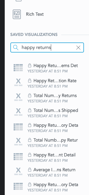
Happy Returns* | View Happy Returns Shipment data and inventory detail. Extra Items reporting can be found in Reports > Other. |
|
Checkout+* | View Checkout+ and Package Protection details. Understand offer and attach rate, along with return rate, AOV, and ARV trends for returns with and without coverage. |
|
*The Checkout+ and Happy Returns dashboards are only available for merchants using those features. Additional Checkout+ or Happy Returns data can be found by creating custom copies of these dashboards and searching the Visualization library for objects beginning with Happy Returns or Checkout+.
Note: For all dashboards, the dollar sign ($) is used only to denote currency fields. All revenue metrics across the analytics dashboard are in displayed in the merchant’s currency, which may not be USD.
Filters
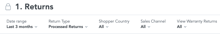
Each dashboard can be filtered by a number of metrics, but one common to all four is the Date range filter. This allows merchants to select a window of time from which to view their data
By default, the relative date range is Last 3 Months. This range starts at the beginning of the month before last and goes up to today's date. For instance, if the report is run on March 15, 2025, it will include data from January 1, 2025 to March 15, 2025.
The following are the default date filter types per dashboard unless otherwise noted:
Returns: Return Submitted Date
Checkout+: Order Created Date
Logistics: Return Submitted Date
Products: Order Created Date
Customers: Order Created Date
Due to the time it takes to process report data, selecting Today or any smaller interval may not display changes in the data returned.
Merchants can also choose between Static and Relative periods when selecting a date range.
Static: Uses specific, fixed dates to filter data. Used when needing to analyze data for a specific period of time.
For example, viewing all returns processed between 1/1/25 and 3/15/25 is a static date range.
Relative: Dynamically adjusted timeframes like Last month or Last quarter, based on the current date.
For example, viewing all returns processed from last month to this month (the last two months).
Tips & Tricks
Tooltips
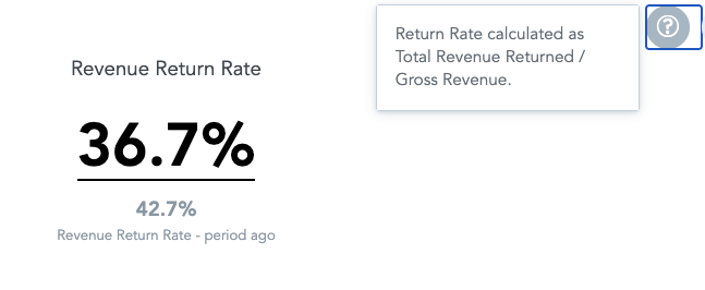
When hovering over a visualization, a question mark icon appears which provides an explanation or callout about the respective section when clicked.
Metric Swaps
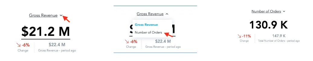
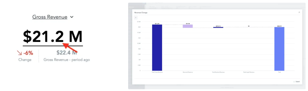
In visuals where the metric name is underlined, metrics can be swapped by clicking the dropdown next to the title.
Example: In the Returns dashboard, Gross Revenue can be swapped for Number of Orders within the time period.
Drill-downs
In most visualizations, users can drill down into more granular time or dimension views. Hover over the visual, then click Click to drill or filter.
Examples from the Returns dashboard:
Drill down into Gross Revenue by clicking on the metric value. This shows the Revenue Change visualization, which displays Net Revenue as a calculation of Gross Revenue - Returned Revenue + Retained Revenue + Upsell.
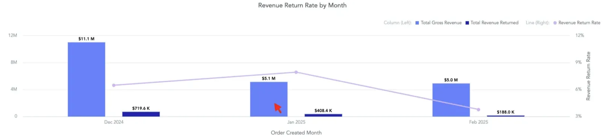
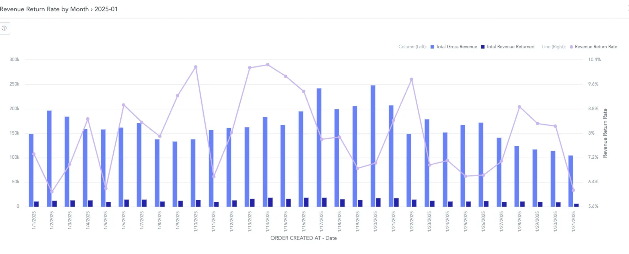
Drill down into the Revenue Return Rate by Month visualization by clicking on one of the bars. This shows a By Day version of the visualization, which can be viewed in hourly detail if clicked once more.
Please reach out to support@loopreturns.com with any additional questions.