
Analytics 2.0: Customize Reports & Dashboards
OVERVIEW
This article covers the dynamic reporting and dashboard customization capabilities available within Loop Analytics. It explains how merchants can personalize reports by adjusting visualizations, adding filters, and fine-tuning layouts to surface the data most relevant to their business. The article also covers how to save, share, and explore reports, as well as how to manage fields, chart types, and date dimensions within the analytics interface.
Use the menu on the left to quickly navigate this article.
Dynamic Reports
Within Loop Analytics, merchants can customize reports and dashboards to spotlight the data that matters most to their businesses. Easily add filters, adjust or swap visualizations, and fine-tune the layout to keep the most important insights front and center.
The following video introduces Dynamic Reports and the advanced customization capabilities they unlock.
Customizing reports and dashboards
The following videos show how merchants can use and interact with dashboards.
Creating, editing, and saving custom dashboards
Editing and saving visualizations
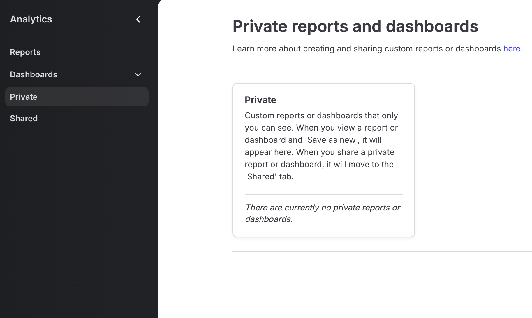
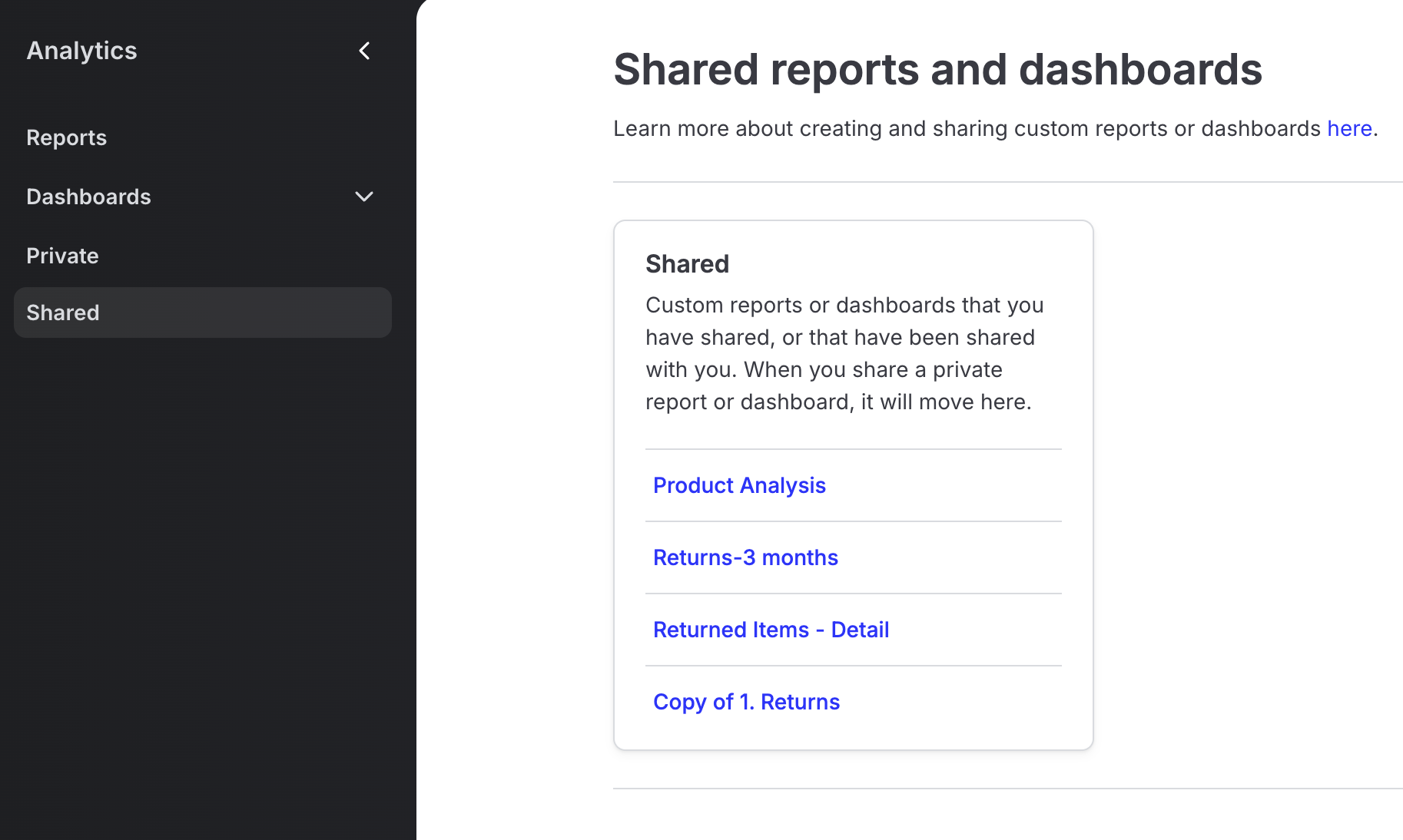
Private and shared reports and dashboards
When a custom report or dashboard is saved, it will appear in the Private tab of the Analytics nav.
When a private report or dashboard is shared, it will move to the Shared tab. The Shared tab is populated with custom reports and dashboards that the merchant has either shared or that have been shared with the merchant.
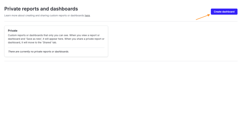
You can also create a blank dashboard from the Private tab if you’d rather start from scratch. To do this, navigate to the Private tab and click Create Dashboard at the top of the page.
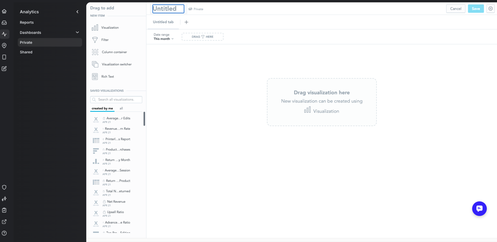
This creates a new dashboard in the Private tab and opens it in Edit mode. From here, you can pull in existing visualizations from the visualization library or create new ones by clicking and dragging items from the New Item section in the top-left corner.
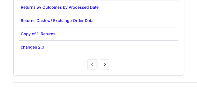
Both the Private and Shared tabs display up to 15 dashboards per page. To view additional dashboards, use the left and right arrows at the bottom of the dashboard list to navigate between pages.
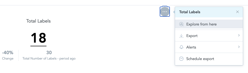
Explore from here
When viewing a dashboard outside of Edit mode, selecting Explore from here from the menu in the upper-right corner of a visualization opens an editable exploration view. From there, merchants can change filters, remove dimensions, adjust chart types, or reorder columns.
Note: Use this option when you need to look up specific data points or export a customized, one-time report. Changes made from here cannot be saved to the original report or dashboard.
Edit Options
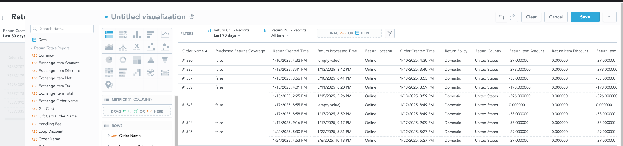
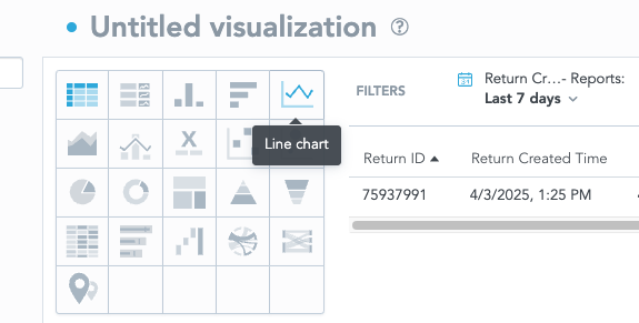
To switch visualization types (for example, from a bar chart to a line chart), use the chart icons to the left of Filters. If switching from a Table to a Chart without a metric in use, there will be a prompt to add one in order to create the new visualization.
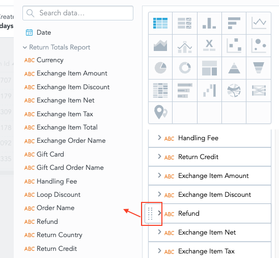
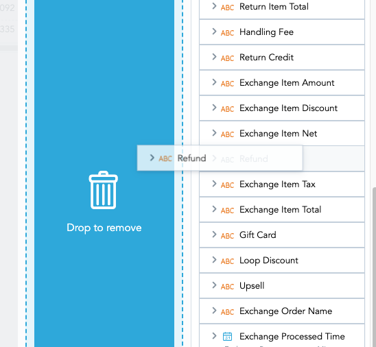
To remove or add fields to a visualization, drag and drop fields from within the data objects pane on the left to the Metrics, Rows, or Columns sections.
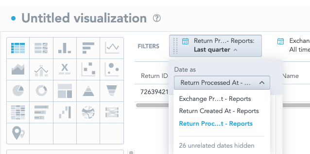
To change date filters, click into the date filter to swap out. Under Date as, there will be a list of Date dimensions you can use instead that will work with the visualization's current metrics.
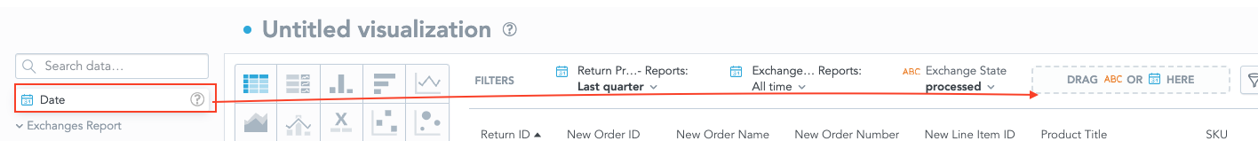
To add an additional date dimension, click and drag the ‘Date’ object in the left hand objects pane into the Drop space that will become highlighted in the filters pane. Then click into the new date filter and select the desired date dimension and period.
FAQ
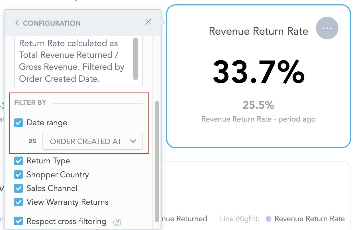
How can I configure the date dimension a specific metric is filtered by? When in Edit mode of a dashboard, click into the visualization you wish to configure. A three dot menu will appear; click and select ‘Configuration’ from the list. Scroll to the Filter By section, which will show a list of date dimensions available to use as the date range. The new date dimension selected will update the values with the same timeframe set in the overall dashboard filter (for example, the last 3 months).
Note: Deselect the Filter by option if you don't want your visualization to be affected by dashboard filters.
I want to build a report or dashboard completely from scratch - how do I do this? At this time, only pre-built Loop Reports or Dashboards can be saved as copies to edit and customize further. More customization capabilities will be released in 2025.
I opened a Loop dashboard/report, chose Explore from Here on a visual, and made edits and saved them. Why didn’t my updates get saved on the original dashboard/report? When exploring visuals within a Loop created dashboard or report, you can create new visualizations but they can't be saved onto that template since it is locked. Your visualization will instead be saves to a backend library, where it can be accessed when you create and edit copies.
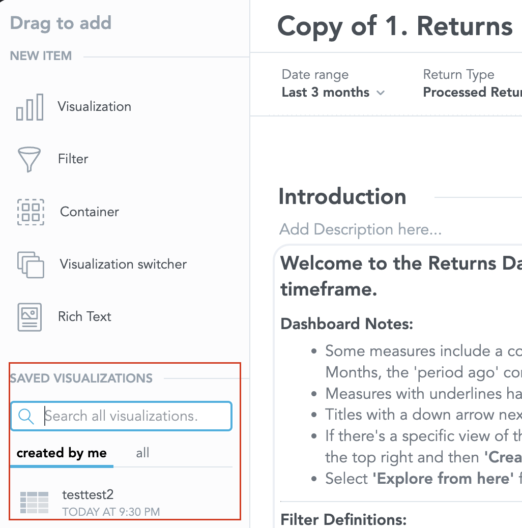
How do I access saved visualizations I create from Explore from Here? All visualizations created by you will appear under the ‘created by me’ list in your ‘Saved Visualizations’ library, which is only accessible when you are in ‘Edit’ mode of a private or shared dashboard.
If I don’t want to save a visualization I edit from a template, and just export the result, is this possible? Yes! After applying your edits, click on the three dot menu icon in the upper right of the visualization, which will provide you with a list of Export options: XLSX, CSV (formatted), CSV (raw).
I saved my own copy of a report. I want to use Dynamic Reports to create a customized view, but it doesn’t seem to be working. How do I do this? Any customized reports created before August 5, 2025, are based on the old 1:1 data-to-report model. We are retaining these datasets to ensure continuity in existing reports that you have modified. To use Dynamic Reports, create a copy of the default report and make your customizations from there.
I want to change the order of the fields in my report, but I’m unable to reorder the numeric fields. What’s happening? Numeric fields are now set up in our platform as metrics instead of attributes. All metrics (fields that can be summed, averaged, or calculated) must be placed on the right-hand side of a table, following the table attributes. This is best practice for reporting and analytics tools.
I’m trying to customize the Exchanges, Out of Stock, New Item Taxes report, but the options aren’t the same as those in the other reports. Why? Our backend datasets for these reports are unique based on data for exchanges, specifically Shop Now. Therefore, we maintain separate data models for these reports, allowing us to include all relevant information in a single view. We have expanded the fields in these datasets to ensure greater customization capabilities.
When I customize my reports, I notice a gray box at the bottom of the field list that says “Unrelated data items hidden.” What does this mean? When building a report in Analytics 2.0, you may notice a gray message at the bottom of the field list stating, "Unrelated data items hidden." This simply means that the platform is helping you by only displaying fields that are connected to the dataset you're currently working with in your report.
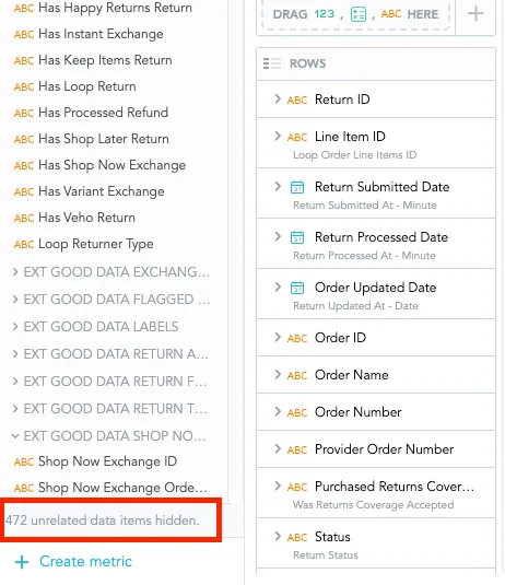
Think of it like this: if you're creating a report using order data, the platform will hide fields that only apply to something unrelated so you don’t accidentally add something that won’t work with your report. This helps keep things simple and ensures your results make sense.
What are some best practices I can implement when creating reports using the Dynamic Reports functionality? When using Dynamic Reports, it’s essential to start with a clear business question in mind. This will help you focus on the data that matters most and avoid creating overly complex reports that are hard to interpret or act on.
Here are a few best practices to keep in mind:
Start with a specific question: Think about what decision you’re trying to support. For example: “How did returns change after we launched our new product line?” or “Which shipping methods are most commonly used by customers in Canada?”
Limit your scope: Avoid building one report with too many unrelated metrics or filters. Instead, create focused reports that tell a clear story or answer one question well.
Choose actionable data: Prioritize metrics that lead to insights you can do something about. If a data point doesn’t help you make a decision, it may not belong in your report.
Use filters wisely: Filters are powerful! Use them to narrow down your data to what’s most relevant for your question or audience.
Keep your layout simple: A clean, uncluttered report is easier to read and share. Group related data together, and avoid duplicating the same numbers in multiple ways.
Dynamic Reports are designed to be flexible—but the best reports are focused, purposeful, and easy to understand.
Please reach out to support@loopreturns.com with any additional questions.