
Checkout+: Storefront Best Practices
OVERVIEW
This article covers storefront best practices for Checkout+, including cart placement, button configuration, attach rate optimization, branding customization, and mobile optimization. These recommendations are based on data from top-performing merchants and are designed to help you maximize your Checkout+ attach rate without hurting checkout conversion.
Use the menu on the left to quickly navigate this article.
Best Practices
Please review the best practices below to ensure your storefront delivers a great Checkout+ experience for shoppers.
Important: The first three best practices are requirements for merchants on the Checkout+ rev-share model to ensure healthy attach rates.
1. Put Checkout+ in the cart (Required)
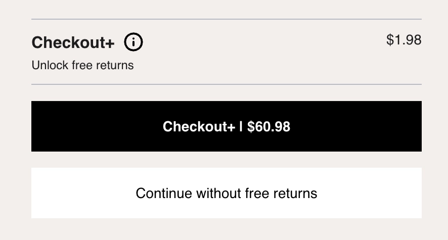
Cart placement is the single most impactful decision you can make. The two-button cart experience consistently outperforms checkout-only placements. If Checkout+ is only shown at checkout, you're leaving money rate on the table.
The example below shows Checkout+ placed directly in the cart using the two-button experience.
2. Checkout+ styled as primary button (Required)
One button adds Checkout+ protection; the other declines. The button that adds protection needs to be your primary button styling. The button that declines can be your secondary button styling or a hyperlink.
Opt-in framing with full price visibility is what drives customer confidence and high attach rates for top-performing merchants.
Important rules for the two-button setup:
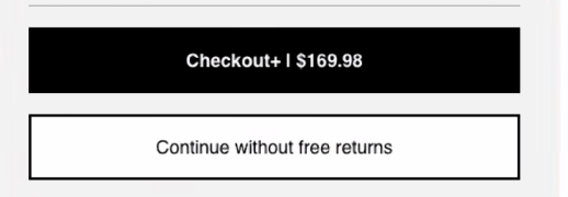
The Checkout+ button must be on top
It must use your prominent, primary brand color
Switching the button order or using a secondary color is directly linked to lower attach rates
The example below shows the correct two-button setup, with the Checkout+ button on top in the primary brand color.
Important: Do not swap button order or use secondary/muted colors for the Checkout+ button. Both changes measurably reduce attach rate.
3. Remove competing buttons from the cart (Required)
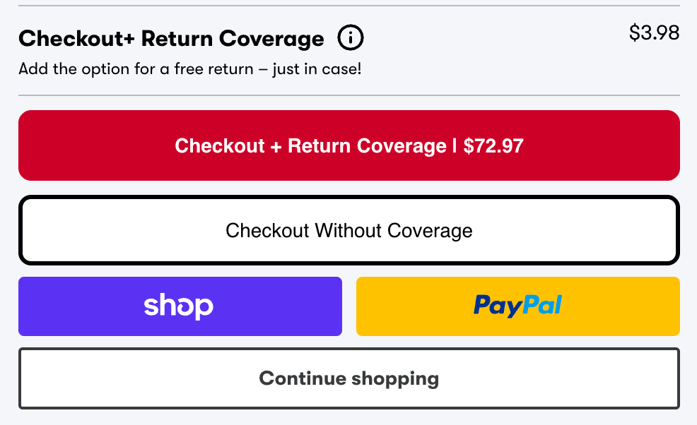
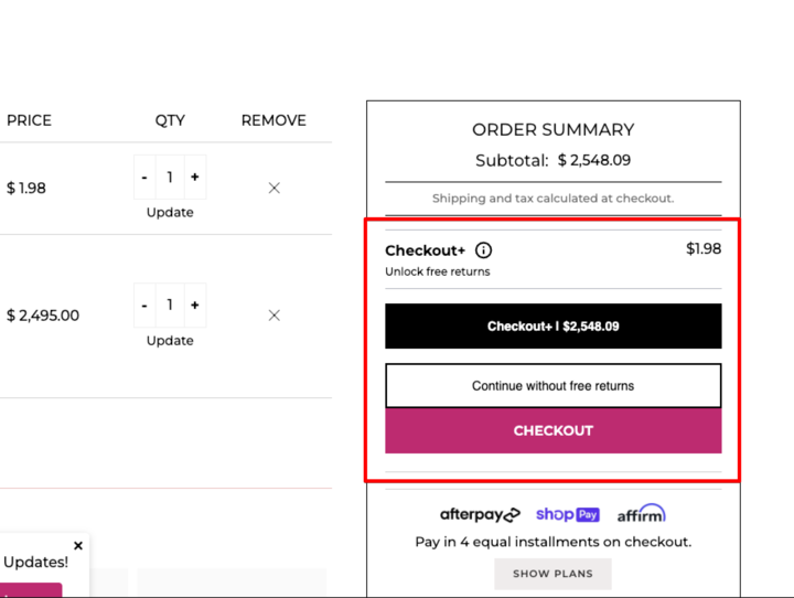
When Checkout+ is live in the cart, no other buttons should compete with the Checkout+ decision. Extra buttons — whether quick-pay options like Shop Pay and Amazon Pay, or navigation buttons like "Continue Shopping" — create confusion at a critical moment in the shopper journey and directly hurt attach rate.
Below are examples of what not to do:
To remove these extra buttons from your cart you can select to remove the Buy Buttons from your theme editor or remove them directly from your theme code.
4. Use Loop's Recommended Button Copy
Loop has optimized this copy through user testing, A/B testing, and data from live merchants. We recommend the following to maximize attach rate while keeping the offering transparent for shoppers:
For merchants offering Returns Coverage:
Primary Button: Checkout+ | [cart total]
Secondary Button: Continue without free returns
For merchants offering Package Protection:
Primary Button: Checkout+ | [cart total]
Secondary Button: Continue without free returns OR Continue without package protection
5. Optimize mobile experience
To keep the mobile cart experience focused, make sure no competing elements distract shoppers from checking out. Extra elements like discount banners or chat widgets that overlap the checkout buttons can crowd the cart and create a frustrating customer experience.
Check the following on mobile specifically:
Checkout+ button is visible without scrolling
Checkout+ button can be tapped without closing something else first
Tap-target size is large enough on small screens
Copy length, so text doesn't truncate awkwardly
We recommend using your theme editor in Shopify to verify your cart experience.
6. Add the 'Recommended' tag
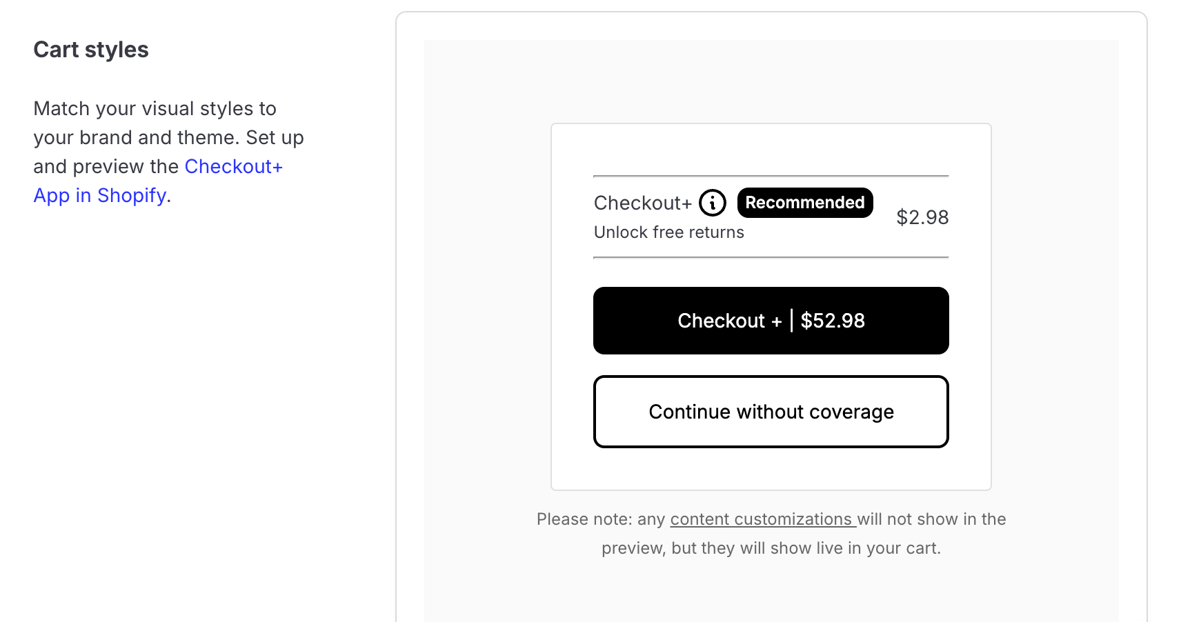
Display a "Recommended" tag on the Checkout+ cart item with a customizable color theme. This reinforces the Checkout+ option as the preferred choice for shoppers.
To enable it, navigate to Admin > Returns Management > Shopper Experience > Checkout+ customizations, or go directly to this page in admin. In the Cart styles section, toggle Recommended tag on and select a color theme to match your brand.
Learn more about Checkout+ UI customization.
The screenshot below shows the Recommended tag toggle in the Cart styles section.
7. Add branding to customize Checkout+
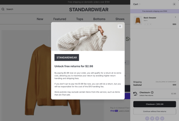
You can add a custom banner image to the info modal header to reinforce your brand at the moment shoppers are evaluating the offer.
These brand customizations are available at Admin > Returns Management > Shopper Experience > Checkout+ customizations, or directly at this admin page.
Learn more about Checkout+ UI customization.
The screenshot below shows where to add your custom banner image for the info modal header.
Please contact your Merchant Success Manager or reach out to support@loopreturns.com with any additional questions.