
Analytics 2.0 Best Practices
OVERVIEW
Analytics 2.0 is your central hub for understanding performance, spotting opportunities, and making more intelligent decisions. This article will walk you through how to get started, highlight practical use cases, and showcase how other brands are already winning with Analytics 2.0.
Use the menu on the left to quickly navigate this article.
Getting Started
Set yourself up for success from day one.
Visit Exports, Alerts, and Filters for detailed how-to guides.
Explore your dashboards and reports: Analytics 2.0 offers prebuilt dashboards for Returns, Logistics, Products, and Customers. These are ready-to-use starting points for common business questions. Analytics 2.0 also offers 20+ reports with varying degrees of granularity such as returns, line items, and return reasons.
Schedule exports: Automate dashboard and report delivery to yourself or specific teams like Finance, Operations, or Marketing so insights are shared without manual effort.
Set up alerts: Don’t wait until it’s too late. Create alerts for key metrics like:
Return rates spike above a threshold
Returned item value for a single return above a set currency amount
Average label rates for a specific carrier exceed a threshold
Spotlight: Identifying Customers with Frequent Returns
A popular swimwear brand was concerned about customers with a high volume of returns. They used the Costly Customers section of the Customers Dashboard to set up an alert, flagging any customer exceeding 15 returns in the last 12 months. This allowed the brand to proactively manage high-return customers and reduce unnecessary costs.
Key Concepts
Basic concepts for data reporting and visualization to help you get the most out of the platform.
Analytical Designer: Analytics 2.0 unlocks customization capabilities via our platform’s Analytical Designer. When you “explore from here” or create a new visualization, you’ll be working in the Analytical Designer. It provides access to metrics, attributes, and facts from your data catalog, which you can drag and drop to build charts, tables, and other visualization types.
The interface includes drop zones where you place data elements, configuration panels for customizing visualization properties, and filtering capabilities. Once created, visualizations can be saved and added to dashboards for reporting and analysis.
Visualization: A visualization is a visual representation of a user’s analytical view of the data.
You create visualizations in Analytical Designer where you can choose from different visualization types to better present your data (for example, bar charts, tables, or waterfalls). You build visualizations from metrics, attributes, and optionally filters that are combined in a way to visualize a particular aspect of your data.
The visualizations are executed over and over as fresh data gets loaded.
Interpreting the content of a visualization is up to the user (the consumer of the visualization).
Filter: A filter is a set of characteristics or conditions that, when applied, removes specific values from the original data in a visualization. Filters allow you to narrow the scope of a visualization without changing the visualization itself. You can create filters based on attribute values, metric values, or dates.
How Other Brands Use Analytics 2.0
Real-world use cases to inspire your own.
Omni Channel Visibility: See online and retail sales and returns side-by-side for a complete customer journey.
Customer Segmentation: Compare first-time customers to repeat customers to understand returns behavior and tailor loyalty strategies.
Product Performance: Spot high-return rate items to optimize merchandising and layer return reasons to understand trends like sizing issues.
Operational Efficiency: Automate scheduled exports once to share with cross-functional teams on a regular cadence.
Spotlight: Reducing High-Return Rate Products
A leading men’s apparel brand knew that their typical return rate averaged around 20%. Using the Product Return Details section of the Product Dashboard, they set up an alert and automated export to flag any items with a return rate above this threshold. This enabled the merchandising team to quickly identify problematic products and take action—such as improving size guides, updating product descriptions, or addressing quality issues.
Dashboard Use Cases
Specific business questions and use cases for dashboards.
Monitoring Revenue Impact and Returns: You want to understand how returns are affecting your bottom line. Use the Revenue Impact section on the Returns Dashboard to track Gross Revenue against Returned Revenue, and analyze the Revenue Return Rate over time. This helps identify trends or seasonal patterns in returns that might require policy adjustments.
Analyzing Return Outcomes: You want to optimize your return policies to maximize revenue retention. You can use the Return Outcome Information section on the Returns dashboard to evaluate how effectively you’re converting returns into exchanges, store credit, or upsells. The dashboard shows metrics like Upsell Ratio, Upsell Revenue, and Average Upsell across returns, allowing the you to assess which return options are most profitable.
Geographic Return Analysis: You’re selling internationally and want to understand where your returns are coming from. Using the Returns by Geography visualization, you can identify if certain countries or regions have higher return rates than others. You can compare this against Orders by Geography to determine if there are specific markets where your products might need improved sizing guides, better descriptions, or alternative shipping methods.
Identifying Problem Products - You notice a higher-than-expected return rate overall and want to pinpoint which specific products are causing issues. Using the Product Performance Summary section of the Products Dashboard, you can quickly identify the "Products With Highest Number of Returns". By drilling down into these problematic products, you can view return reasons and even analyze performance at the variant level. This enables you to take targeted actions like improving product descriptions, addressing quality issues with vendors, or potentially discontinuing problematic items.
Optimizing Product Catalog Based on Customer Behavior - You want to understand which products drive customer loyalty versus which ones lead to one-time purchases only. You can use the "Products Driving the Highest Number of Repeat Purchases" visualization to identify your star performers, while also analyzing the "Products Driving the Lowest Number of Repeat Purchases". Combined with return rate data from the Product Return Details section, you can make strategic decisions about which products to promote more heavily, which to improve, and which to phase out from your catalog.
Tips and Tricks
Make the most of Analytics 2.0.
Slice and dice with filters: Apply commonly-used filters (date, channel, product category) to tailor reports to your specific questions. Establish these filters as views for easy access.
Start simple: Pick one or two KPIs that matter most (e.g., revenue return rate, net shipping cost) and expand as you grow comfortable.
Share insights widely: Export or schedule key reports so everyone sees the same data — no silos, no confusion.
Look for patterns over time: Daily numbers fluctuate; long-term trends reveal true performance.
Spotlight: Streamlining Operational Readouts
An accessories brand regularly relied on the Return Reasons by Line Item report to prepare slides for their operational readout meetings. Instead of manually navigating to the report in Loop Admin each time, the team set up an automated weekly export of the results to key members of the operations team. This simple automation saved valuable time, ensured everyone had the latest data at their fingertips, and allowed the team to focus on interpreting results rather than pulling them.
Troubleshooting
Quick ways to get unstuck when something doesn’t look right.
Common Things to Check
Filters: Confirm the right filters are applied (e.g., date range, channel, product). A missing or extra filter is one of the most common reasons numbers don’t match expectations.
Data refresh timing: Analytics 2.0 updates on a schedule. If you’re comparing to a “live” system, today’s data may not be fully loaded yet. Refresh cadence is every six hours, 5 am, 11 am, 5 pm, 11 pm US Central Time.
Multiple views of the same metric: The same KPI might appear in more than one dashboard. Ensure you’re looking at the right definition of the metric filtered in the same way.
Reporting Best Practices
Validate with small slices: If a total looks wrong, filter to a single product or day to sanity check.
Compare to historical trends: If a number feels off, see if the trend makes sense compared to past performance.
Keep it simple: The more filters and customizations you apply, the easier it is to get confused. Start broad, then narrow.
FAQ's
I am getting this error when I “explore from here” in a dashboard. What is causing it, and how can I fix it?
Please attempt the following steps to resolve your issue:
Ensure you are using Google Chrome.
Clear your browser cache, close your browser, and try again.
Try incognito mode. If this works and the other options didn’t, you may have a browser extension that is causing this issue.
Restart your computer.
If none of the above work, then connect with Loop Support.
I am getting a “Too Many Data Points to Display” error on a report or dashboard.
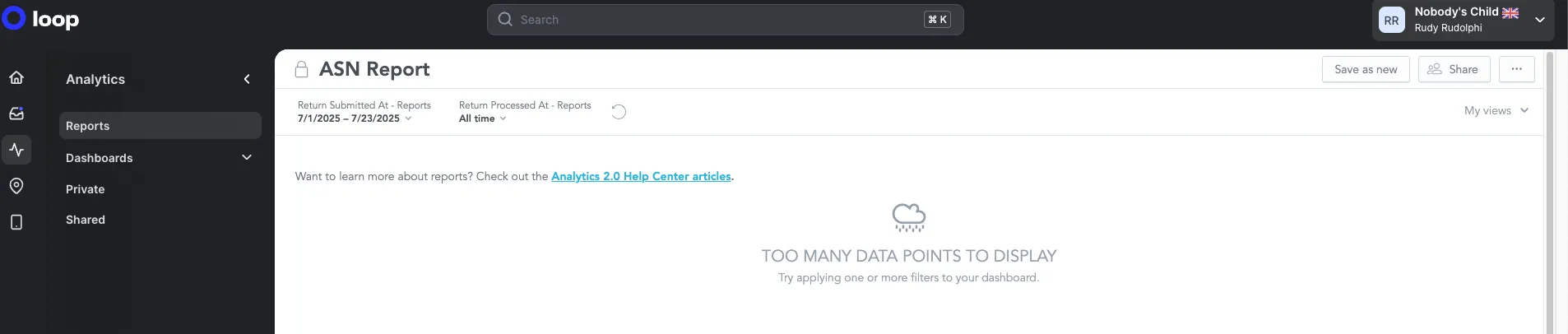
This behavior is expected when the resulting number of data points, based on the selected filters, exceeds 100,000 records. However, the report remains exportable even when that error appears. Download the report from the table as you normally would.
Why is my Shopify reporting different than the revenue numbers shown in Loop?
There are a few reasons you may see differences between Shopify reporting and the revenue numbers in Loop:
Date fields – Loop currently uses the Shopify order created date, while Shopify’s standard reports often use the order processed date. This difference can cause timing variances, especially for orders created late at night or processed the following day. We’re actively validating this data in Loop to ensure accuracy before shifting to align with Shopify’s processed date.
Time zones – Shopify reports and Loop may apply time zones differently, which can drive slight discrepancies in daily reporting.
Revenue definitions – We’re also reviewing how gross revenue is calculated in Loop to ensure it matches Shopify’s definition of subtotal price + discounts.
We’re working to resolve these differences so that Loop revenue reporting more closely aligns with Shopify. In the meantime, we recommend using Loop data directionally and Shopify as the system of record for official revenue reporting.
Please reach out to support@loopreturns.com with any additional questions.